The first impression counts. With web push, this should be taken literally — because in the first few seconds after the page loads, the most important decision is made: Will the user accept the push opt-in or block it?
An “Allow” means direct access. A “Block,” on the other hand, is often final.
If this moment is handled incorrectly, you lose reach, revenue — and trust.
The technical flow: How the opt-in actually works ⚙️
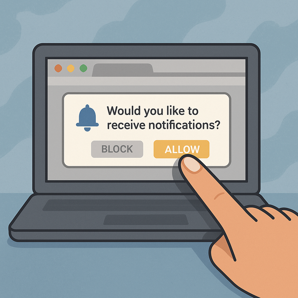
Before a website is allowed to send push notifications, it needs the user’s active consent. This happens through the system prompt triggered by the browser — a small window with two options:
„Show notifications“ or „Block“
💡Important: This system prompt may only be shown once.
If the user clicks “Block,” the site cannot simply trigger it again.
They would have to manually reverse it in the browser settings — and very few do.
👉 A bad first attempt permanently costs reach.
Pre-permission popups: The UX pattern from iOS 📱
A clever trick came from the app world: the pre-permission popup.
Apps show their own small window before the actual system prompt:
„We just want to inform you about important news or exclusive offers. Agree?“
Only when the user responds positively here is the actual browser prompt triggered.
This pattern significantly reduces the block rate because:
-
the user understands the context,
-
makes a conscious decision,
-
and the surprise (“Why is the browser asking me this?”) is avoided.
🎯Pre-prompts can double the opt-in rate — especially on news portals and e-commerce sites.
The most common mistakes in the opt-in process 🚫
Many publishers waste potential due to small UX mistakes.
The top 3:
1️⃣ Opt-in too early: The user sees the prompt before even perceiving the content. Trust = zero.
2️⃣ No context: No indication of what to expect (“Breaking News,” “Price Alerts,” “New articles in your category”).
3️⃣ No retry attempt: Whoever says “No” once is lost — there is no alternative entry point (e.g., via a small bell icon or widget).
💬Conclusion: Timing and transparency are more important than design.
Best practices: Conversion rates between 8% and 12% are realistic.📈
Studies and practical experience show: 8–12% of all visitors accept web push when the flow is well designed.
Success factors:
✅ Trust: Ask only after 5–10 seconds, once the user is already engaged.
✅ Clarity: Short, positive message (“Stay informed on important topics”).
✅ Design: Subtle display, no pop-up shock attack.
✅ Thank you: After the opt-in, a short feedback or mini animation (“Notifications activated”).
💡Early, but contextualized sending leads to longer engagement — users who receive push notifications regularly in the first 90 days stay subscribed for over a year.
GDPR & data minimalism as a real advantage 🧩
Unlike email newsletters or app logins, web push is privacy-friendly:
No personal data, no tracking, no cookies.
The opt-in is based solely on the browser token — an anonymous key.
For publishers, this means:
-
No risk from cookie banners or double opt-in requirements
-
No data protection hurdles for monetization
-
Faster consent, because users have fewer reservations
👉 GDPR compliance becomes a competitive advantage.
Conclusion: Onboarding is the most important click of your strategy.
Web push lives on trust. The moment of the opt-in determines whether you reach a visitor once — or permanently.
Every good web push strategy therefore does not start with monetization,
but with UX, timing, and transparency.
🔹 A clean flow protects your brand.
🔹 Good communication increases conversion and retention.
🔹 Privacy-friendliness creates acceptance.
Or in short:
No good onboarding, no reach. No reach, no revenue.
Recommendations for action 💡
✅Use pre-prompt: Provide context first, then ask the browser.✅ Optimize timing: After 5–10 seconds or after the first scroll interaction.
✅ Communicate context: Why are push notifications valuable for the user?
✅ Make opt-in measurable: Regularly analyze conversion & block rates.
✅ Stay legally compliant: HTTPS, clear consent, immediate opt-out option.
Autor: Ulf Heyden